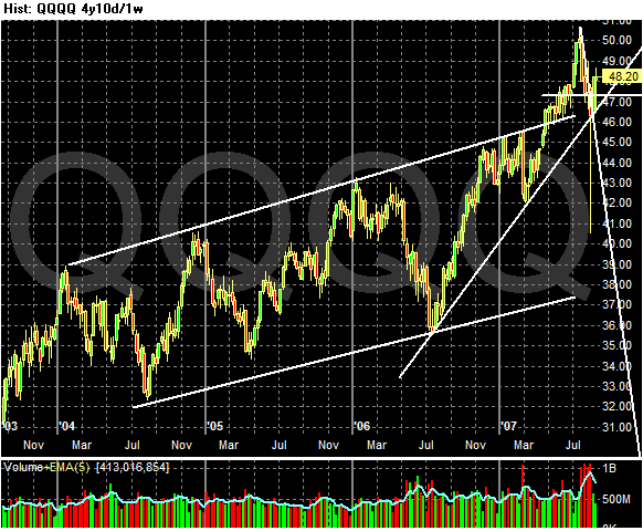
The first is a 4-year weekly chart. Like the SPYs, this index traded in a wide, upward-sloping channel for the last roughly 4 years. However, the market broke out of this channel earlier this year. If spiked above the upper-channel line and has since dropped back to test this support.
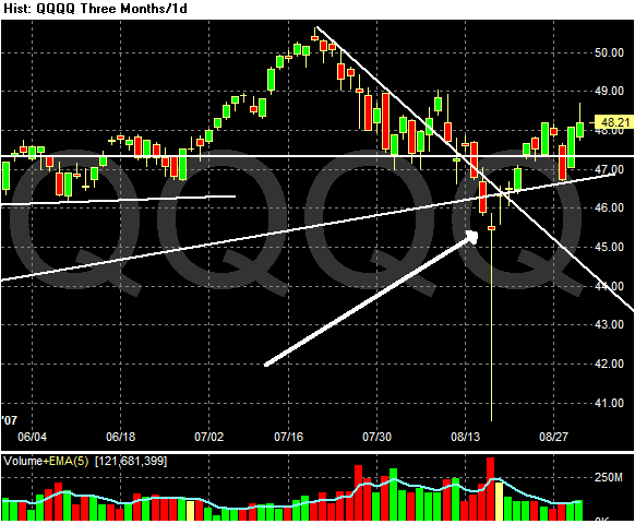
Here is a 3-month daily chart. Notice where the arrow is, right after 8/13. These was a lot of volume on this day and a hanging man candle stick. This indicates this day was a short-term selling climax for the QQQQs. The index rose from there, moving back through the upper-trend line referenced in the above analysis. Since then the index has dropped to that level again, retested and moved higher.
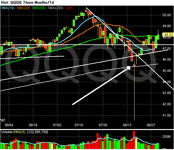
Finally, here is the same 3-month chart with moving averages added. Notice the above mentioned hanging man/high volume day also occurred just above the 200-day SMA. In other words the index fell to a standard technical support line, held and moved higher. The 10-day SMA is about to move through the 20-day SMA which is another bullish indicator. Finally, the recent price action may be enough to start moving the 20-day SMA higher.
Short version -- this index is starting to look very interesting.