The most interesting relationships are those that are totally unexpected, and when they show up in a graph your jaw drops and you think, "WTF?!?"
Here's a graph I've run versions of many times before, of "real average hourly earnings," that is, the YoY change in wages minus the YoY inflation rate. As you can see, this has been negative more often than not since 1973, (the tech boom stands out as a notable exception), and specifically has been significantly negative for over a year:
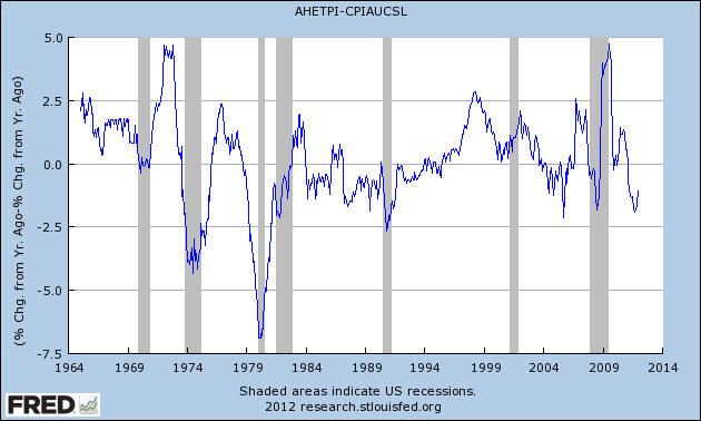
It is also worth noting that, while a decline in real wages has not always coincided with a recession, recessions have almost always been presaged by a decline in real wages. In fact, the decline in real wages for the last year plus has been one of my biggest concerns.
But now let's take the exact same data and look at it not as year over year percentages, but as an absolute relationship. To do that, I divided average hourly earnings by the consumer price level and here is what I got:
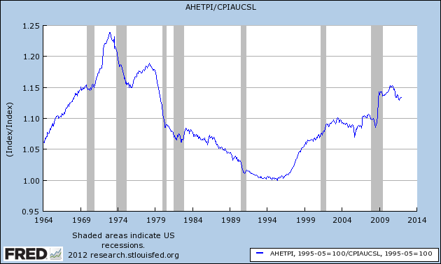
This was totally unexpected. While real average wages declined from the early 1970s into the mid-1990s, they hit bottom in May 1995 and have been generally rising since! That big spike during the "great recession" is when gasoline prices went down but wages stayed flat. If you're thinking "WTF, that can't possibly be true!" that was my thought too, but there's the data and it speaks for itself.
Casting around for an explanation, I did recall one trend which seems to correlate well with the long downtrend followed by an upturn in real average hourly earnings: the labor force participation rate. There was a long post-WW2 uptrend in the percentage of women entering the workforce. That peaked in the 1990s and has been generally going sideways since. So this next graph adds in the inverse of the participation rate (right scale, subtracting the participation rate from 100%), i.e., the higher the participation rate, the lower the value:
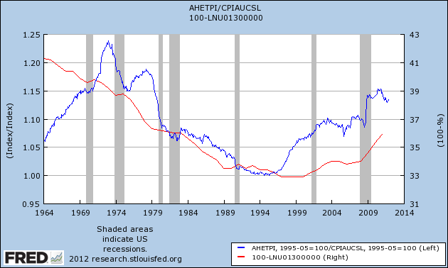
Of course, correlation is not causation, but it makes sense that an increase in the population entering the workforce would tend to depress wages, while an increase in the population leaving the workforce (boomer retirements as well as other causes) would tend to increase wages.
A few notes: (1) the metric is average hourly earnings of nonsupervisory employees, so the increase is not due to corporate CEOs and Wall Street financiers; (2) the graph still shows that during the anemic expansion of 2002-07, real earnings barely increased at all. That expansion was toxically built on debt; and (3) the significant decline in real earnings since late 2010 is still very much a concern.
In any event, I'm all ears for considering other explanations, but the surprising simple fact is that the overall trend in real wages for the last 17 years has been up.