- by New Deal democrat
I was working on a couple of year-end type pieces yesterday, when I downloaded one graph that says so much about what has happened to the US economy, and in particular to the fortunes of the US middle class, during that time.
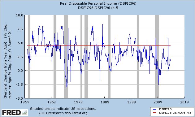
Here it is, the YoY percentage growth of real disposable personal income:

I've drawn a line across it at the +4.5% mark.
Remember, this is disposable income, and it is adjusted for inflation, for a period of over half a century.
I pulled it for my year-end piece, because real disposable personal income grew again, especially in the second half of this year. But even so, it was at a pathetic pace of less than 2.5%.
But the longer term is even more startling. Before 1974, real personal disposable income grew, on average, at about 4.5% a year. After 1974, the only times that has happened beyond a month or two was (1) right after Volcker broke the back of inflation in 1982, when unions still had some clout, and interest rates on things like CD's could still be had at rates like 7%; and (2) during the tech boom of the mid- to late 1990's -- the only time in the last 40 years that "felt like" the 1960's.
I remember the 1960's. The 1960's kicked ass!!! We were number 1, we were the most prosperous middle class that had ever existed in the history of mankind, and we knew it.
Two oil shocks (the 1970's and the 2000's), and one era of financialisation, trickle-down, and offshoring later, in 2013 I am thankful that the middle class got a little respite.