- by New Deal democrat
As promised, I've put more thought into the decline of -0.2% in average wages in last week's December jobs report. I've also read other analyses. So, here are some more considered thoughts.
First of all, last Friday's number is quite an anomaly, and it is likely to be revised higher. Here's a graph showing m/m% change in production and nonsupervisory workers (blue), the m/m% change in the aggregate wages paid to them (green), and the m/m% change in average wages (red), during the last two expansions. Here it is from 2002-07:

and then from 2009-14:
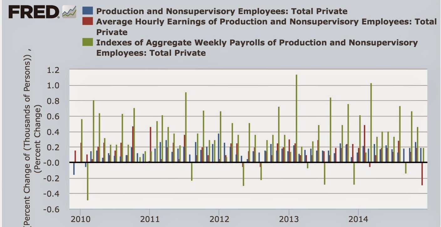
Only in one other month, in 2003, when everything was weak and people were worried about a "double-dip recession," did average wages decline by even -0.1%. In short, December's number was a huge outlier, and is likely either simply due to being the occasional nonrepresentative sample, or likely to be revised away in the next month or two. An analysis by Golman Sachs (h/t Business Insider) notes the same, and further notes that it may be noise generated by there being one fewer working day than is usual in the December sample.
Another article today in Business Insider references a Deutsche Bank note that the "Companies planning to raise worker compensation" metric from the NFIB report this morning is a good leading indicator, with an approximate 9 month lag, of the Employment Cost Index. Here's the graph of that relationship (note the NFIB metric is moved back 9 months in this graph):
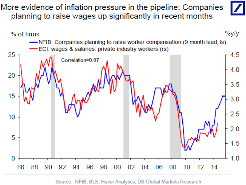
The Employment Cost Index is a median measure of worker compensation, reported quarterly. The 2014 Q4 report will be released at the end of this month. I wondered if the relationship might also work with the monthly average wage measure from the jobs report, and it appears it does. Compare the blue line in the above graph, dating from 1985, with the similar blue line in nominal average hourly wages, also from 1985 to the present, in the below graph:
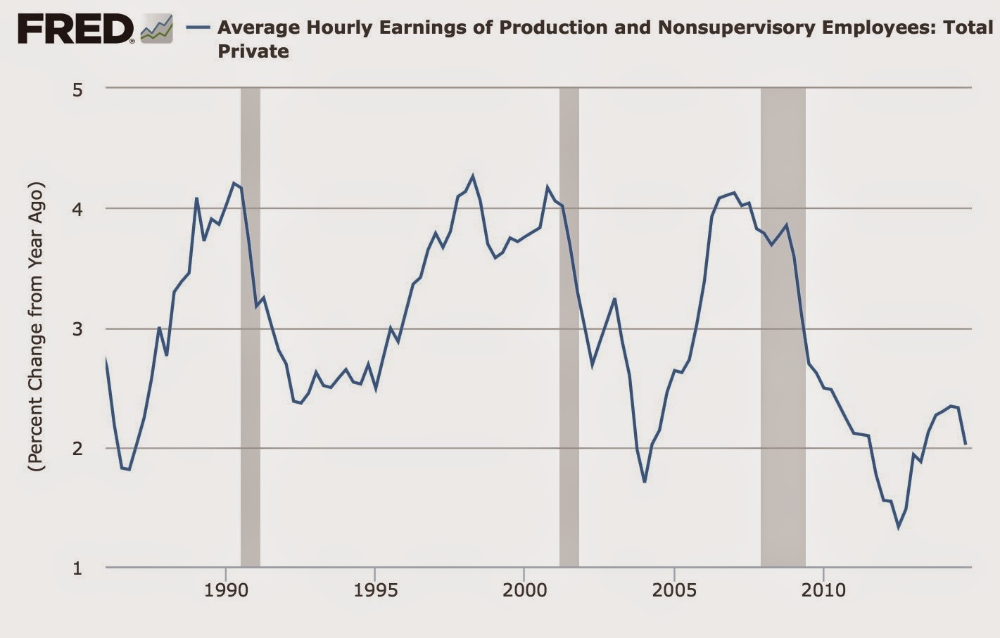
I've been looking for good leading indicators for wages. This NFIB metric looks like and excellent candidate. For comparison purposes, I've noted that the unemployment rate appears to be a good leading indicator for nominal wage growth. Here's the update on that graph through December:

Note that, unlike the unemployment rate, the NFIB metric was flat in 2012-13, appearing to accurately forecast the flatness of the YoY% growth in nominal wages in late 2013-14.
Now, however, both the unemployment rate and the NFIB measure of companies planning to increase workers' compensation are forecasting significant increased growth in wages.
I remain concerned that the last few months have actually shown a decline in the YoY growth in wages. This time could always be different. But at least the forecasting tools give reasonable grounds for continued optimism.